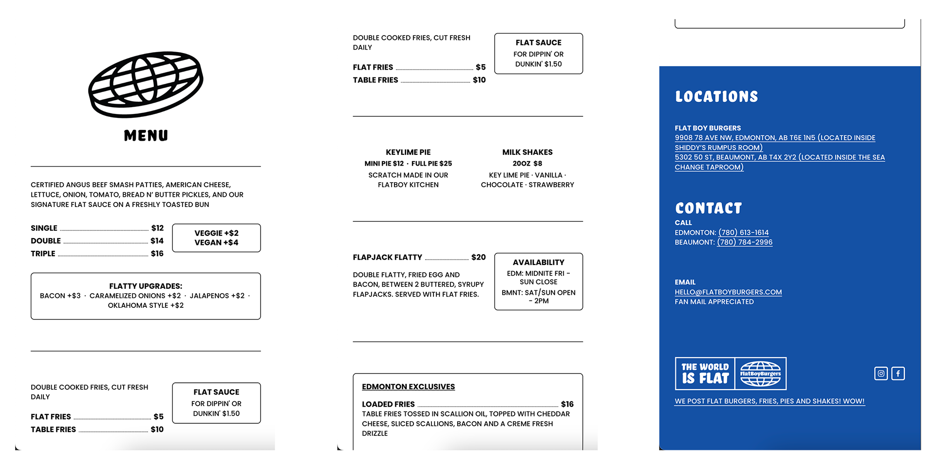
FlatBoy Burgers Website
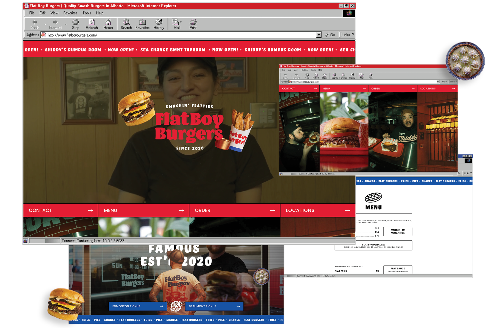
The website design for FlatBoy Burgers captures the bold, unapologetic personality of the brand and its celebration of classic smash burgers. Videography, photography, and subtle bouncing elements on the one-page site keep the experience energetic and buzzing, while maintaining clarity and directing attention to the details that matter most.
CLIENT: FLATBOY BURGERS
STUDIO: DOJO
ROLE: DESIGNER, DEVELOPER
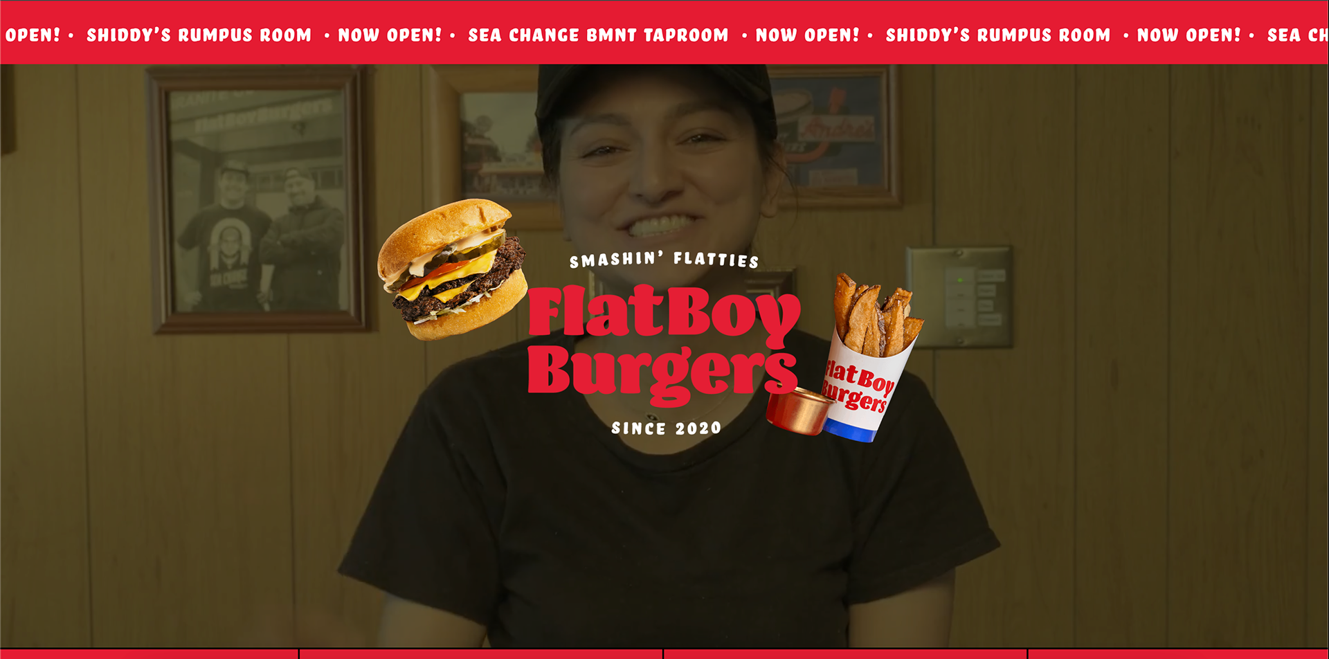
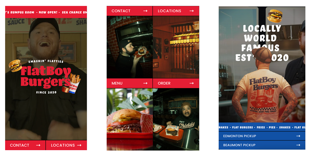
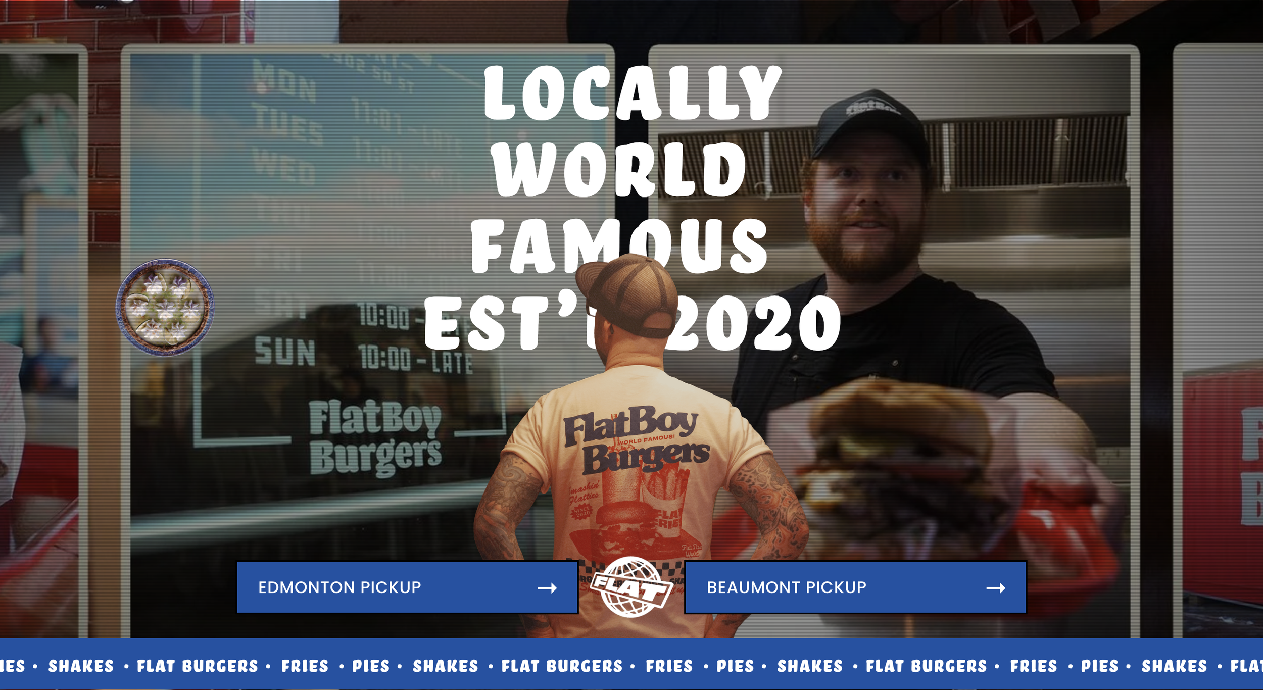
HERO SECTION
A scrolling marquee provides instant updates on new locations without cluttering the screen. Background video handles the heavy lifting—establishing the brand’s atmosphere, food, and interior culture. To add a layer of play, interactive menu items cutouts break the standard grid.
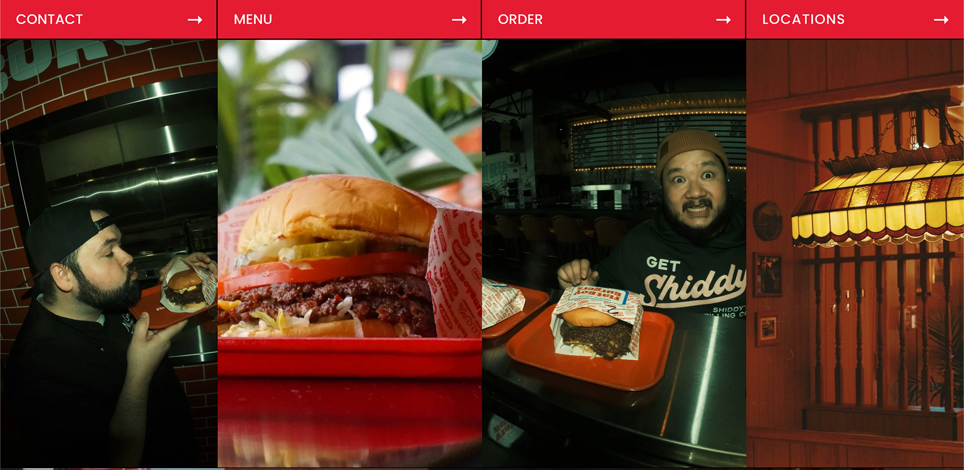
NAVIGATION
The navigation sits directly below the Hero to ensure it is visible upon entry. An text and image-card system enhances traditional navigation to maintain brand personality while providing clear visual cues for each section. Using anchor links eliminates load times, allowing for a natural, continuous scroll through the site.
ORDERS
Rather than treating the order section as a static utility, a "DVD Screen Bouncer" cycles through a burger, fries, and pie upon hitting the screen edges, adding a sense of nostalgia. Content layering is used here to add visual depth and subtly highlight the latest merchandise.